Prologue Book Cafe - BFA Thesis
My BFA thesis project was to create a book café environment within the gallery setting. I created a total of 12 book cover designs, 4 LP designs, and full branding for Prologue book café.

Prologue Book Café Logo
When I began thinking about what I wanted to do for my thesis exhibition, I found myself caught in-between doing something primarily branding focused or doing book cover design—two facets of design I am passionate about. I ultimately chose I would do a combination of the two. I felt the work would be more compelling if they were placed into a believable and realistic environment, rather than displayed in the typical way that art is displayed in a gallery. This led to my decision to create a book café, allowing me to create branding, a series of book cover designs, and also to be able to focus on other details such as album covers to hang on the walls. By doing this I would showcase more of the skills that I have gained in my time as a graphic design student, rather than restricting myself to one category.
In total, I created 12 book cover designs, 4 LP designs, and branding for the cafe including a logo, sign, pattern, menu, cups, bags, and coffee packaging.
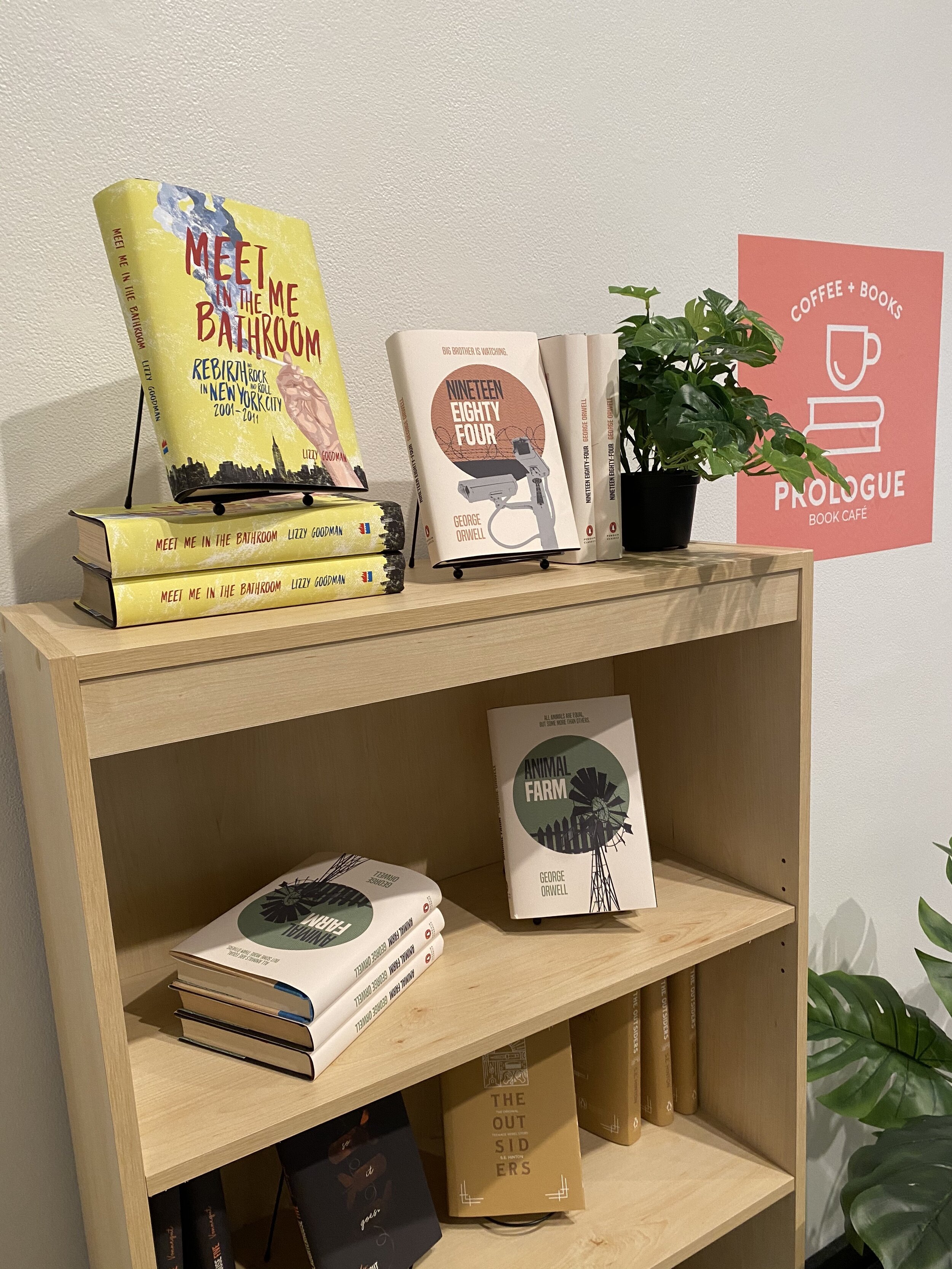

I began by creating the branding for the book café. I aimed to create something that was both in line with my personal design aesthetic as well as something that felt appropriate for a sleek and contemporary, yet casual, café. When coming up with a name, I wanted it to be memorable but simple and catchy. I opted for Prologue, which is defined as the introductory section in a literary or music piece. This name plays both on the idea of coffee and breakfast/brunch items being typically served at the beginning of the day as well as the idea that this exhibition and my graduation from college will essentially be the start of a new chapter in my life.
I decided that in order to fit the feel of the café I was striving for; the logo must be simplistic and clean. Therefore, I simplified the logo down to the bare essentials—a cup of coffee/tea on a stack of books. In developing a color scheme, I chose warm colors to both reflect a warmth and coziness, but also leaned towards some of my favorite colors to reflect some of my personality.
After the logo was finished, I created an undulating wave pattern to mimic the curves in the logo design. I carried this throughout the branding—on the rug, coffee labels, and menus. During this process, I also had to make decisions about the style of furniture that would go into the space as it is important that it complimented my design choices. I went for a contemporary style that I felt went well with my concept and design for Prologue as I envisioned it.

